
I hope you get value out of this blog post.

The overarching theme of many principles of UX design is simplicity. Hick’s Law argues that the simpler our options are, the more easily we can make a decision. Miller’s Law argues that the more pieces of information our brain is processing at the same time, the harder it is to process (and the more likely we are to get confused).
By the same token, the law of prägnanz suggests that our brains are constantly trying to simplify the visual information they’re receiving as much as possible to make it easier to process. As a financial advisor, communicating effectively means communicating as simply as possible. Let’s unpack what the law of prägnanz is, why it’s relevant for financial advisors, and how you can apply it in your written communication.
German psychologist Max Wertheimer along with a few other psychologists developed a set of rules, known collectively as “Gestalt Psychology,” about how humans perceive and interpret the world around us.
One of those Gestalt rules is the law of prägnanz (sometimes translated as the law of good figure or the law of simplicity). It argues that the human brain instinctively tries to simplify the visual world around it as much as possible. One can argue that we already know the principle behind this - KISS.
The classic example of this is a movie theater marquee with a circle of lightbulbs around it. Often, the lightbulbs will flash on and off in sequence—our brains will simplify that visual by interpreting it as a single light traveling around the border of the sign. In reality, however, it’s just a series of individual bulbs flashing on and off in a pattern.
How on earth does that apply to financial advisors? Well, our clients’ brains are doing the same thing with everything they see all the time — including the emails we send and any presentations or visuals we show them during meetings.
If you don’t format those emails or presentations in a way that makes it as easy as possible to visually process and interpret, you aren’t communicating as clearly as you could be.
Visually complex or dense information can be confusing and daunting for your client to follow, which can lead to clients not following through on your recommendations or not understanding what it is you’re doing for them.
When clients don’t understand the services you’re providing or don’t follow through on your advice, they also won’t understand the value you are creating for them. If they underestimate your value, they may start doubting whether or not they need a financial advisor at all.

That’s why it’s so important to do everything you can to communicate as clearly as possible with all of your clients. Following scientifically proven principles of how humans process information is one of the best ways to optimize your communication for maximum understanding.
To better understand how this law applies to your advisory practice, it’s better to demonstrate it with an example. Let’s say you met with a client earlier today and now you’re sitting down to write a follow up email.
A lot of financial advisors will just dump all the information into an email and hit send. The result is something that usually looks something like this:

Notice that, even though it uses bullet points, the text is all bunched up together with little visual distinctions to help readers organize and process the information.
Because of the law of prägnanz, the brain’s instinct is to lump all of that text together into a single block. It may be a series of distinct sentences but the client will look at it and just see a “wall” of text—which is not very inviting or easy to process.
Now, look at the revised version of the same email, that uses visual principles to help the reader’s brain naturally break up and organize that information:
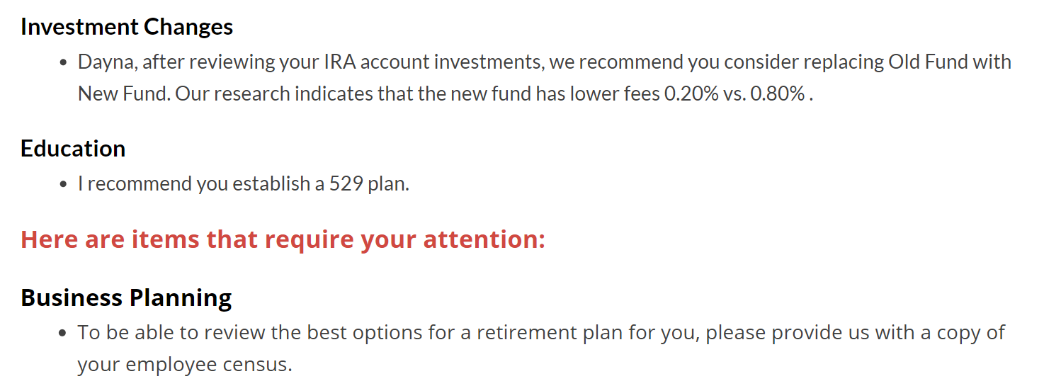
The same three bullet points are here so the same information is being communicated, but the use of headers, spacing, and different font colors has made it much easier for the client reading this email to process that information.
Bolded headers tell the reader what broad category the information beneath it falls under. Not only does this make it easier to understand, it helps the client quickly locate the information they need.
If they’re at their desk, trying to remember which new fund it was that you recommended in that last meeting, they’ll be able to open that email, see the “investment changes” header and know that they information they want is under that.
Using red font to call attention to next steps that the client should take—in this case, providing the advisor with their employee census—is a good way to make sure those steps are taken. Red is an eye-catching color, so even when the client is skimming through your email quickly, their eyes will naturally be drawn to that red text.
Using headers, font colors, and font styles like this is even more important in longer emails. If your follow up email includes 10+ bullet points of information, it’s going to look like a daunting wall of text and your client is likely to just see it and think, “I’ll read this later when I have time.” In many cases, that time never comes.
If, on the other hand, they open that email and see short, bolded headers and bite-sized pieces of information, they’re likely to at least skim the contents for the most important points.
Here are a few tips for formatting your own emails using similar principles:
This kind of formatting and organization of emails doesn’t have to take up more time than you have. Automation tools like Pulse360 can help speed up the process with customized email deliverables and automated summaries so that you can create comprehensive yet easy to process emails in seconds.

